6 Steps For Striking Social Media Graphics
You don’t need to be a professional graphic designer to create striking social media graphics. We’ve compiled six go-to steps to help you effectively market your small business, nonprofit, start-up or your personal social accounts without having to hire a professional. Whether it’s a campaign or a single image to spark your brand identity, these tips can help you think and create like a designer.
Ask Questions
Any successful strategic marketing practice starts with tapping into your curiosity. Start with a round of questions to guide your overall marketing strategy. Finding the answers will prevent you from falling flat with your audience. Here are some questions we ask ourselves to begin the design process:
What is the problem you hope to solve with imagery? We start with this question because it’s the easiest - explore the problem and use design as the solution. Simple. Remember, successful graphic design solves problems. Designers aren’t just creatives - we’re problem solvers. Effective graphic design is crucial to strategic marketing, it’s the way we visually communicate with our audience. Your problem could be the need to advertise your upcoming event or to encourage your customers to purchase the newest line of narwhal themed tea cozies.
What do you hope your post will achieve? This question will guide the majority of the design, like the size of your images, budget for your boosted post (if any), crafting a message and the types of images you want to include. Ultimately, you want your post to guide your audience engagement. . Examples of desired engagement includes: post interaction, clicks, increase in page likes, increase in traffic to your page, brand recognition, etc.
What is your visual brand identity and how will this graphic fit within your scope of work? Your brand’s visual identity goes beyond your logo - it’s a collection of elements telling your story and enabling your audience to build trust with your brand. Your visual identity is (or will be) the foundation of your social media posts. Your images and content make up your brand’s overall personality. We do this at Matchbox by utilizing color, key words, crafted messaging, imagery and even the pages we choose to interact with. Click here for one of our favorite resources: Logo Design Love’s collection of identity style guides. Did you know our federal government has design standards?
Put Pen to Paper
Call us old fashioned, especially since we’re talking about creating web-based graphics here, but we like to start with a real pen-to-paper sketch before opening up Adobe Illustrator. You don’t need to be a talented sketch artist (believe us, we aren’t!) when drafting a rough sketch. This is the best way to layout your design and get your message across quickly. Use the answers you came up with on step 1 and start sketching an outline. Research has shown sketching triggers a direct path to your right brain and allows you to unlock your inventive, intuitive, and creative skills. An added bonus is a sketch, no matter how basic it may turn out, will minimize your design time because you have a visual plan. Here’s our sketch of one of our recent social media marketing campaigns for Rally du Soleil coordinated by the Cinco Amigos of Albuquerque Community Foundation.
Consider Composition
Think first about how you want others to visualize your design. A few techniques to consider are Rule of Thirds, Negative Space and Focal Point.
The Rule of Thirds is one of our most often applied approaches. This is where you divide your image into three even sections vertically and horizontally, making your image into a grid. The intersections of your grid are the optimal focal areas. With your grid laid out, you can design your graphic with the most important pieces placed accordingly. Click here for a great article by Company Folders on using this approach.
Negative Space is the area around the subject in your image and can make all the difference in clearing up clutter to communicate your message effectively. Using negative space helps you balance your overall image or graphic. This can be an especially vital tool for social media graphics since your viewer is seeing your graphic on a fast, scrolling platform. Click here for a helpful guide on negative space by Art Ignition.
Successful designers utilize Focal Point with use of lines, color and framing. An example could be placing your company’s full color logo on the bottom right-hand side of a black and white graphic. The color in your logo will stand out due to contrast and placement. Another way to incorporate Focal Point is by use of lines. We love to use slanted instead of straight lines because they guide your viewer’s gaze in an interesting way. Click here for a great article by Avalyn Creative on 5 Ways to Create A Focal Point.
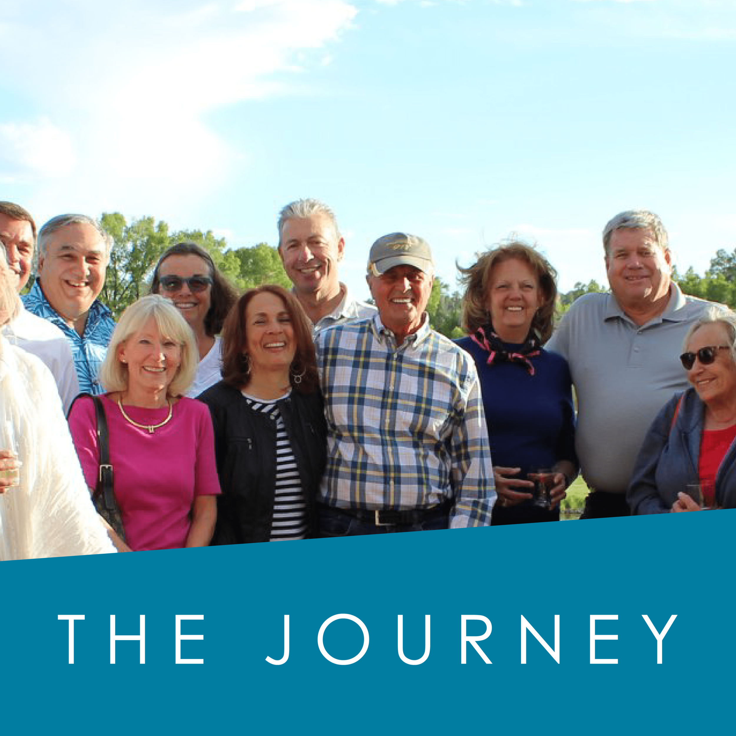
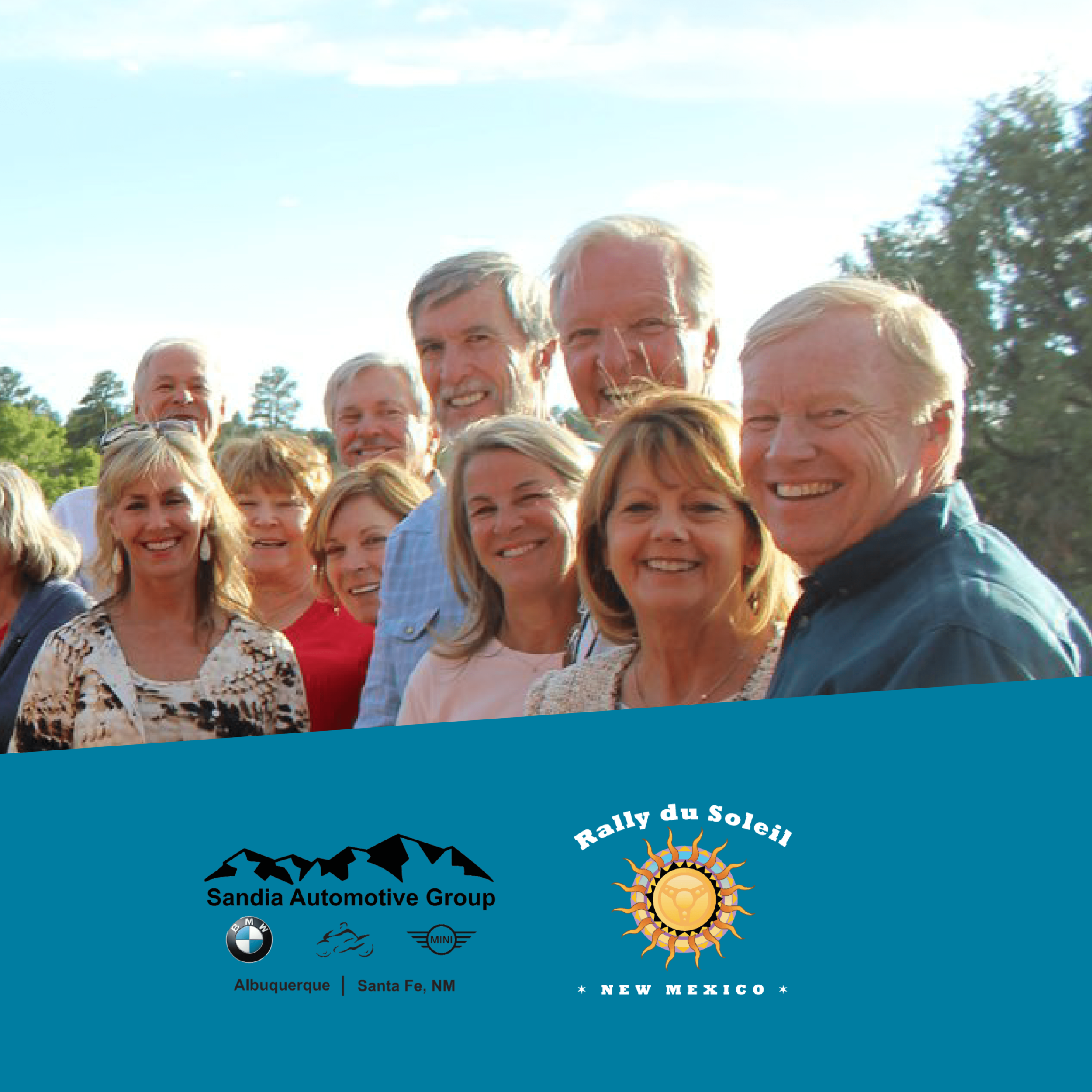
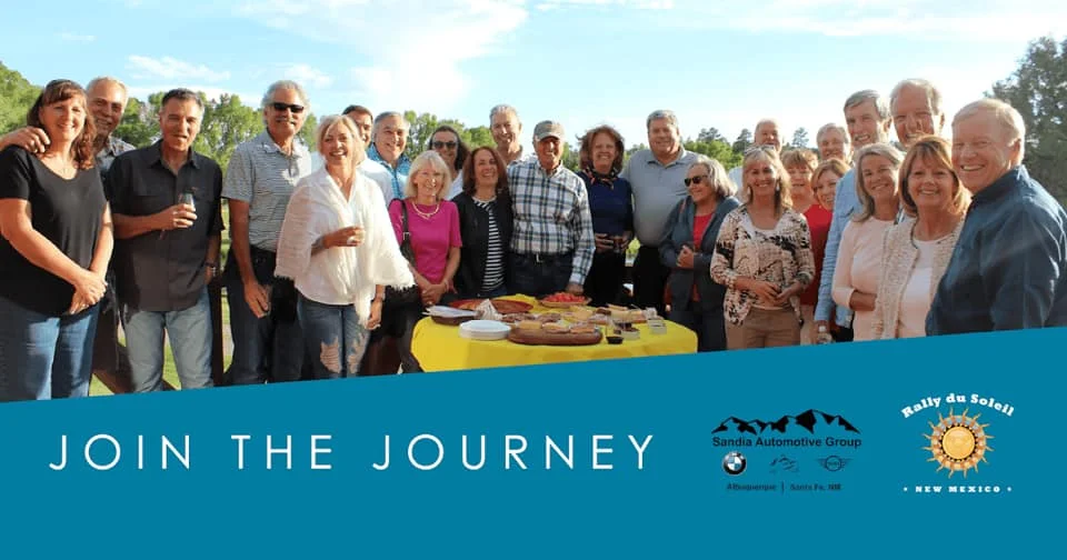
See below for our sketched Rally du Soleil social media images brought to life. Can you tell how we’re using focal point and colors to bring attention to Rally du Soleil’s campaign title, “Join the Journey” and logos?
Image designed for See Hot Cars Facebook page (1200x630px):
4. Invest In Images
The images you select play a major role in carrying out your visual message. Intentionally select images with negative space to help direct your audience’s gaze to your messaging or call-to-action. Look for images featuring smiling faces on the subjects who reflect your targeted audience. Designing for social media is a challenging craft - you have limited time and space to communicate your message so you have to get it right all at once. According to Market Maven, including an image along with your copy increases a person’s ability to retain information by 65%. You don’t need to spend all your marketing budget on a professional photographer or to download a haul of expensive stock images (and in fact you shouldn’t if you want to be authentic!). Look internally. Does your staff have images from your last company event on their phones? Does your social media page already have a photo album with relevant imagery? Dive in!
Lastly, if you’re looking for local stock images, one of our favorite resources is the Free ABQ Images brought to you by the City of Albuquerque, Marble Street Studio and local businesses and organizations. Click here to access their free and beautiful visual content.
5. Size Matters
Social media images are not created equal. Consider the platform’s purpose (Pro tip: we help you assess marketer’s three favorite social media platforms here in our Matchblog post, “How Social Do You Want To Be”) and how to maximize scrolling. Going the extra step to size your beautifully crafted images will set your social media pages apart with a professional edge. We enjoy incorporating three-image spreads for Instagram-focused marketing campaigns like the image below.
Hallee’s tip: bookmark this guide to image sizes by social media platform. Three-image spread designed for @seehotcars Instagram (1080x1080 px each):
6. Be Brave
Take risks with your social media graphics and content - this will guide your visual identity and create a unique personality and memorable brand. Your audience knows whether your content is original because they’re constantly inundated with images on social media. Remember that your audience is becoming more keen on seeking authenticity over polish. Take a stance, be vulnerable and show more than the glossy, professional side of your business. Your followers will appreciate you more and tend to follow along because you appear more relatable. Treat social media as a tool you can use to intentionally show your audience the real you while building trust in your relationships and being true to yourself.
Put Pen to Paper
Consider Composition